Case study
Ipê: an accessible design system for React
11 React components whose colors, type and spacing come from the same design tokens used in Figma. Published on npm, documented in a bilingual Storybook, and the base of Moringa.
Why build one
I wanted design and code to read color, type and spacing from one place. In Ipê, tokens live as JSON, sync with Figma through Tokens Studio and are compiled by Style Dictionary into CSS variables whose names match the Figma variables. A change in one place reaches both.
What's inside
- Badge, Button, Checkbox, Dialog, DropdownMenu, Input, Switch, Tabs, Textarea, Toast, Tooltip.
- Light and dark themes from semantic tokens, following the system or a data-theme attribute.
- Plain CSS, plus an optional Tailwind CSS v4 preset.
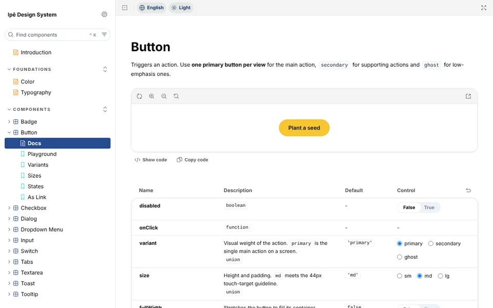
- Storybook that switches every story between English and Portuguese, and between light and dark.
How it is tested
Every story runs in a real Chromium browser on each pull request, in light and dark, with its interaction test and an axe-core audit that includes color contrast. Every color pair is checked against WCAG 2.2, including the 3:1 rule for form-control borders.
The QA cycle after 1.0
After the first release I tested Ipê against a test plan with 24 test cases, including a screen reader (NVDA), zoom and Windows High Contrast. It produced 6 bug reports, among them:
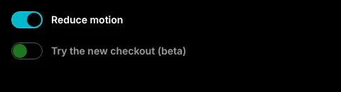
- The Switch disappeared in Windows High Contrast.
- The selected tab looked the same as the others.
- The Textarea counter was read as "9/280", with no context.
- The Checkbox was 22px, below the 24px minimum target size (WCAG 2.5.8).
Each fix shipped in version 1.0.1 with a regression check, so it cannot quietly come back.

Releases
Versions follow semantic versioning, with Changesets writing the changelog. 2.0.0 was a major release because it removed old color primitives for a neutral palette; it also marked the components as client components so they work inside Next.js Server Components.